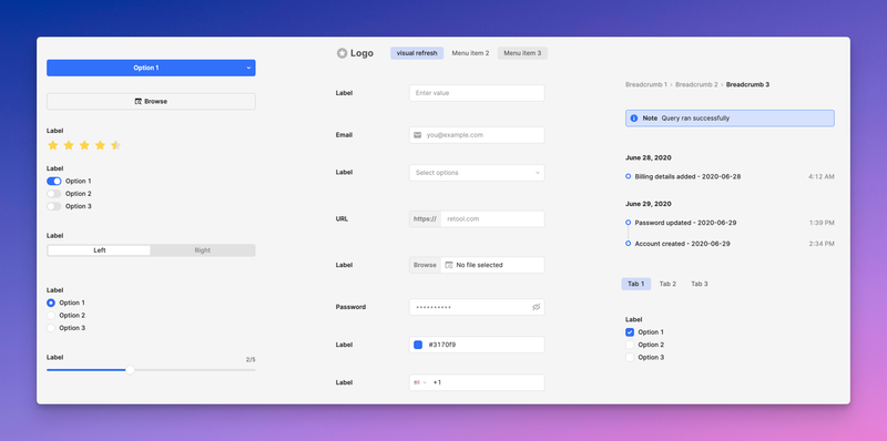
A visually refreshed component library is currently available as an opt-in beta for cloud-hosted organizations. It contains minor style changes to many components, such as:
- An updated color palette.
- Changes to the active and hover state appearance for buttons and inputs.
- Removing borders on input attachments and buttons.
- Fixing inconsistencies with component spacing, font weight, border radius, etc.
- A new look for the Tab and Navigation components.
Any style overrides you've made will still be retained.
Click Get started and leave a comment to request access.