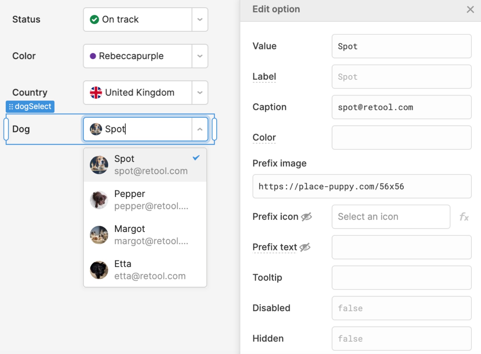
More customizable Select components
Select, Listbox, and their Multiselect variants are getting a lot more customizable! Using the recently launched option list editor, you can easily assign a color, image, icon, and prefix text to each option. The layout will automatically adapt as you mix and match settings, and you can adjust the image size and shape in the Style Editor.
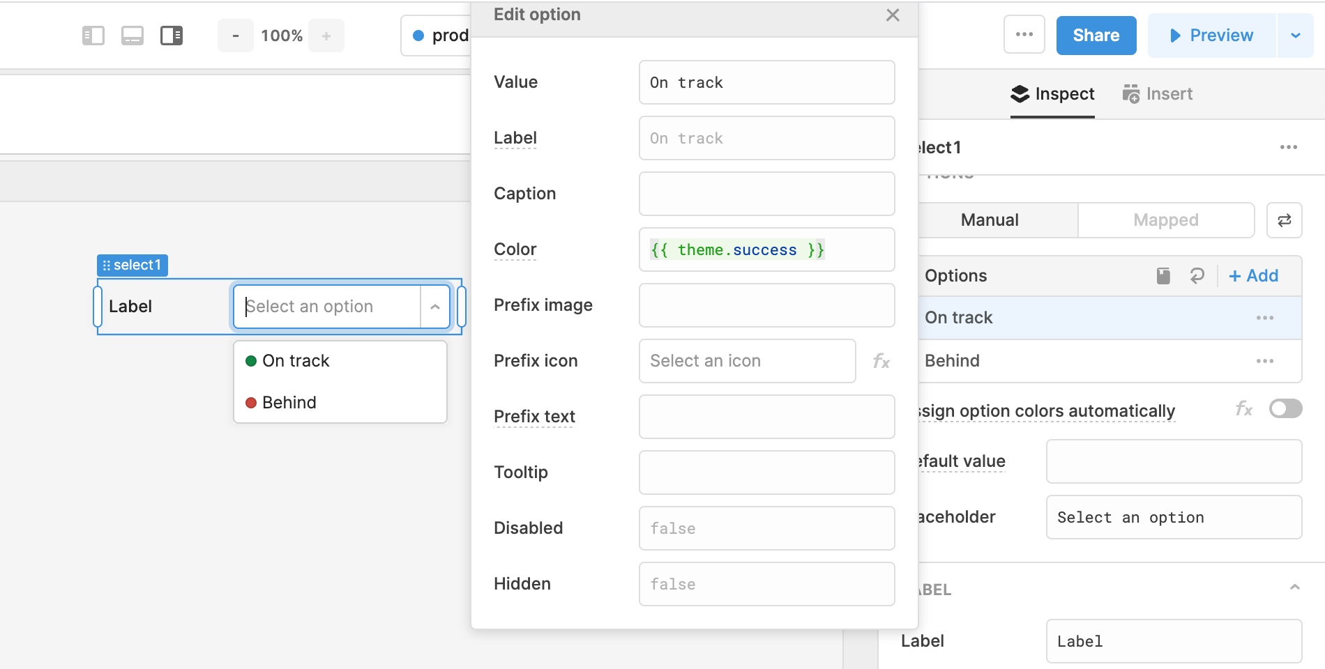
Theme and Style Editor updates
The color picker in the Style Editor now includes all of the swatches from your Theme, including two new optional colors: Secondary and Tertiary. We’ve also added a theme global, so you can reference theme colors directly in your code. For example, conditionally indicate success or failure with {{ someCondition ? theme.success : theme.danger }}.
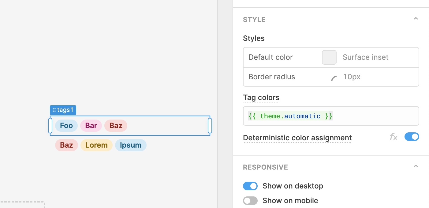
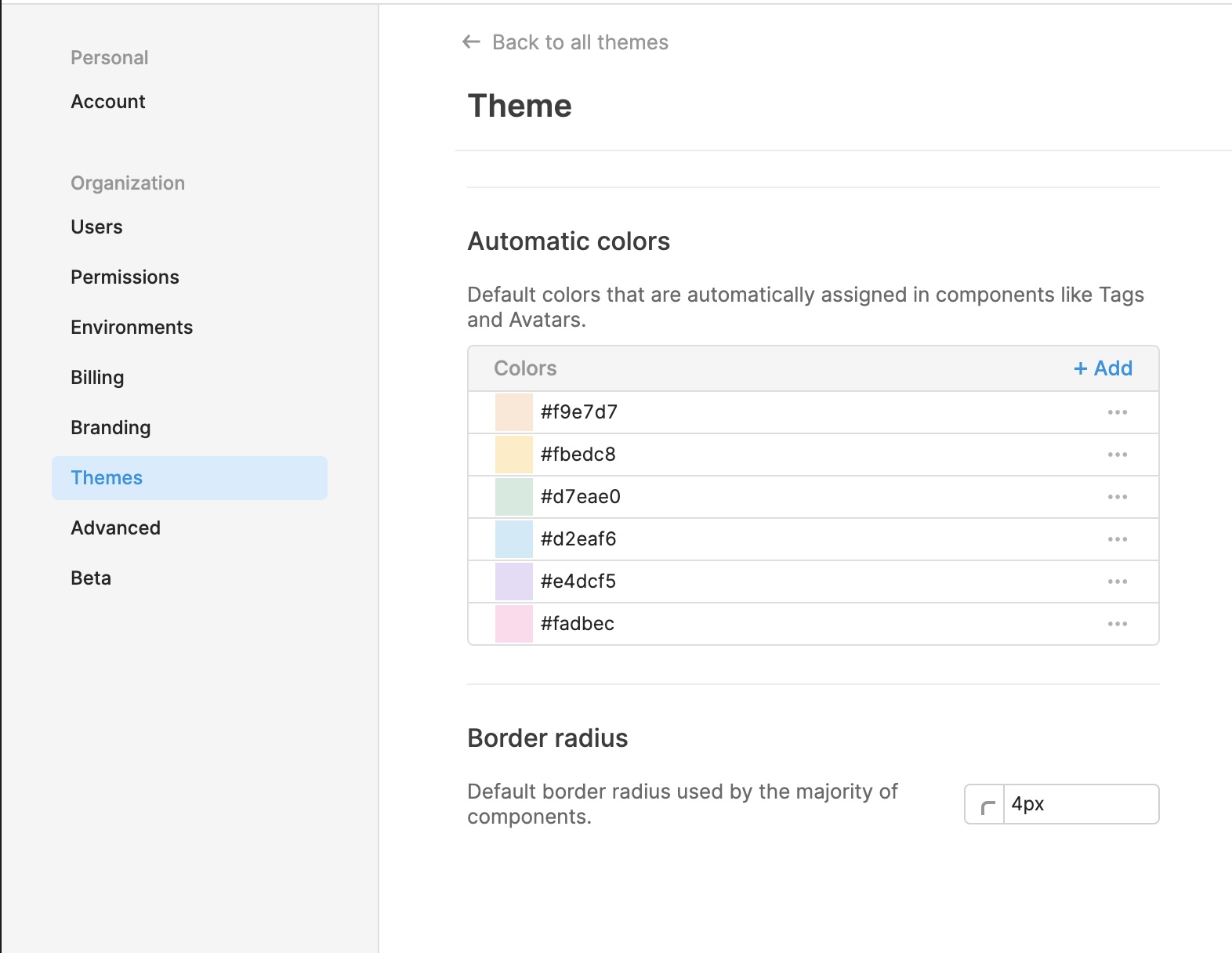
Automatic colors
Last but not least, Themes have also been updated with a collection of Automatic colors that can be used by components like Tags, Select, Listbox, and Avatar. Colors from this collection are deterministically assigned based on text in the component. For example, the tag “Foo” will get the same color assignment no matter where it appears in your app.
Fixes and improvements
- Improved query creation from event handlers so that it default creates the last selected query type
- Fixed the Table component's "select all" menu for checkbox selection
- Fixed an edge case where transformers would not run on page load
- Improved the experience of resizing components
- Fixed Select components that were incorrectly showing validation errors when required was set to true
- Fixed the Table component's "row select change" event that was incorrectly firing twice
- Added a new setting so that Modal .open() and .close() can optionally trigger the Open and Close event handlers
- Added support for the Image component to have a smaller height in Fixed height mode
- Fixed component repositioning via keyboard
- Fixed keyboard navigation on the canvas such that arrow keys do not swap component positions
- Added a warning in edit mode when Table "save changes" events are not configured
- Fixed the Table component's "Row select change" events that were firing twice when rows were selected via keyboard arrow keys
- Fixed Range Slider and Toggle Button components so that they don't automatically trigger dependent queries with the "Run query only when manually triggered" setting on
- Consolidated the 'Dynamically show column' and 'Show column' fields into a single 'Show column' field for the Table component's column editors
- Fixed the Modal component so that it maintains visual height when switched to Fixed height
- Fixed the ability to show/hide a button to clear selection in the Table component
- Fixed "text auto" colors for modules being used in applications
Check out this guide to see the on-prem versions and their release notes. These fixes and improvements will be rolling out to on-prem customers in the next few weeks.