20+ new column types for the Table component
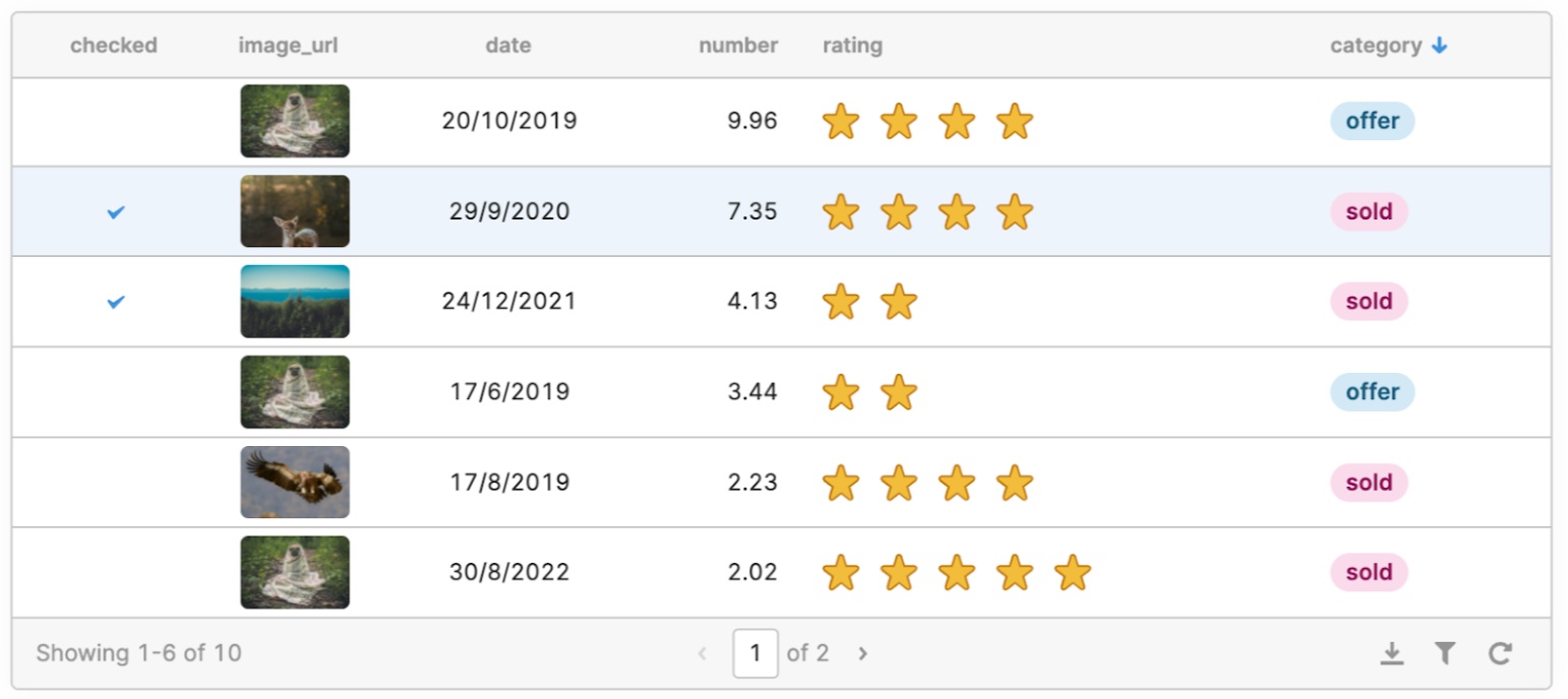
We've brought the power and flexibility of our canvas components–like the new Rating component or the rebuilt Date Time component–to our Table with over 20 new column types to choose from.
Number, Currency, Percent, Rating
These column types provide new and expanded functionality to display numeric values in the Table component. Like the Number Input component on the canvas, you can control decimal places or support any 3-letter currency code. You can also display a star rating of your numeric values with the Rating type.
**User Email **
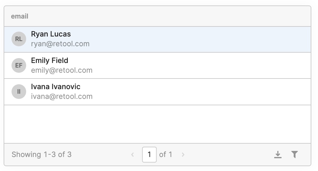
Display formatted emails using the new User Email column type. If the email address has an associated Retool account, you'll get better formatting out of the box: including the email, the user's profile picture (if applicable, otherwise their initials), and full name.
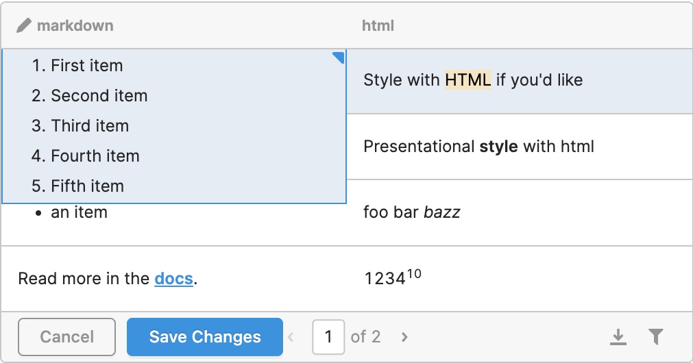
Multiline, Markdown, HTML
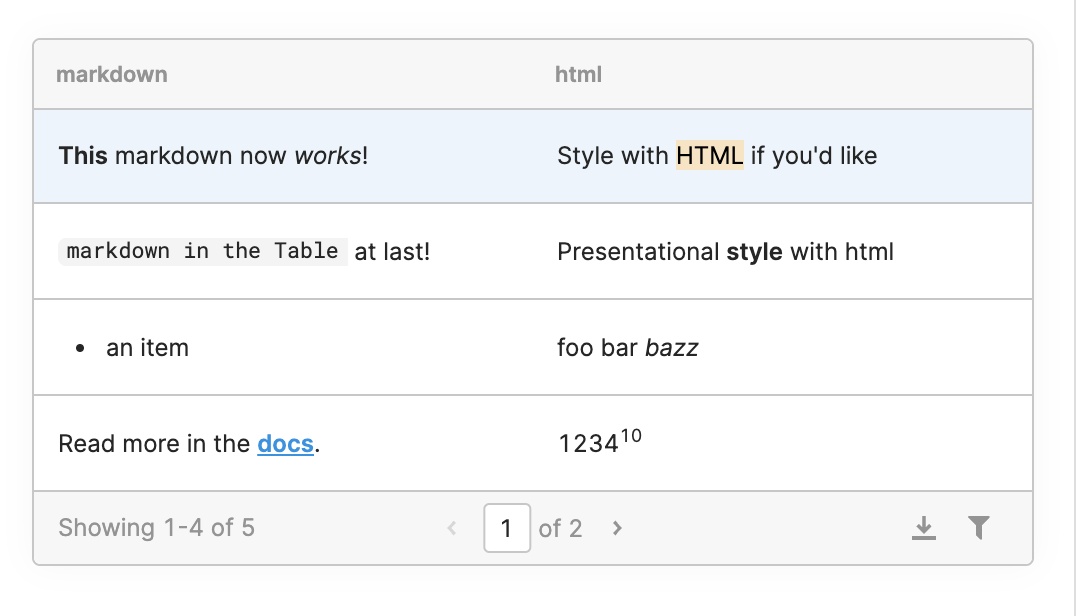
Display multiline text easily with the new Multiline column, or take advantage of full GitHub Flavored Markdown support in the Markdown column. Use the HTML column type to render HTML in your table cells.
Date, Time, Date Time
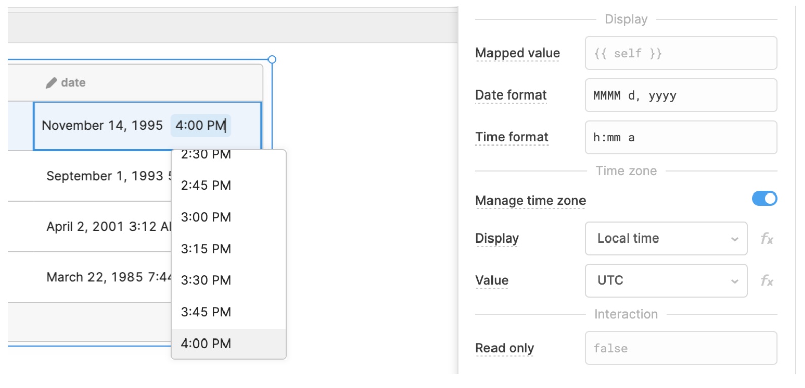
Display dates and times, and automatically handle time zone in the Table with "manage time zone." "Display" time zone controls how time is displayed to your users, while "Value" time zone controls how it’s encoded, so you can do things like have the display time zone follow your user's local browser, but encode the time in UTC! The new Date, Time, and Date Time columns also support an expanded list of formatting strings.
Image Link, Image Upload
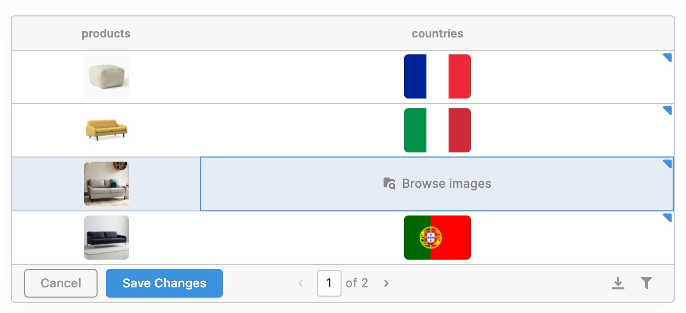
Display images from a URL or allow your users to upload an image directly with the Image Link and Image Upload column types.
Single Tag, Multiple Tag (coming soon!)
---****
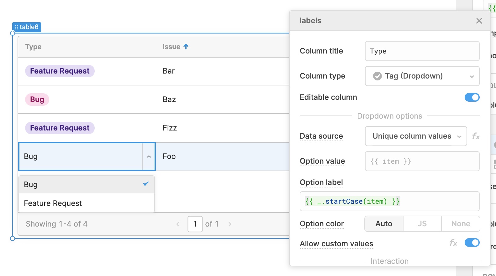
The new Single Tag column type replaces the existing Dropdown column type: when your user edits the cell like above, they'll see the familiar dropdown. You can configure the data source that populates the list of options in the dropdown: it defaults to the unique column values, but you can also choose a query, transformer, or just JS. When your user selects an option, it will be rendered as a tag! Tag colors can be automatic or configured with JS. In the next few weeks we'll be rolling out the Multiple Tag column type, so your users can similarly select multiple options from a Multiselect dropdown.
Additionally, check out the new JSON column type (instead of Object), the Link type, and the rebuilt Modal and Button types.
Usability improvements
****
We've added better overflow handling so that truncated cells will expand on hover, and multiline cells will also grow on hover to show more of their content. The editing experience also got a revamp: there's a new indicator for edited cells in the top right corner of the cell, and we've made it easier to directly edit Boolean and Rating cells.
What's next
In the next few weeks, we'll be rolling out keyboard navigation (e.g. use arrow keys to navigate between cells, type to start editing, etc.). We'll also be adding an upgrade path so that you can migrate your existing column types to the new ones, and get access to all of the expanded keyboard navigation!
If you have any questions or feedback on these new column types, head to our community forum.
Fixes and Improvements
-
Changed Date, Time, and Date Time column types for the Table component to be left aligned by default
-
Fixed Containers so that their children components properly render in a List View
-
Fixed the Multiselect component's read only setting
-
Added support for custom root certificates for the Postgres resource
Check out this guide to see the on-prem versions and their release notes. These fixes and improvements will be rolling out to on-prem customers in the next few weeks.