Options list editor
Many components present a list of options, like the dropdown in a Select or the radio buttons in a Radio Group; we’ve made it much easier to build this kind of UI with our new options list editor. We’ve also added new settings for those options, like captions and tooltips.
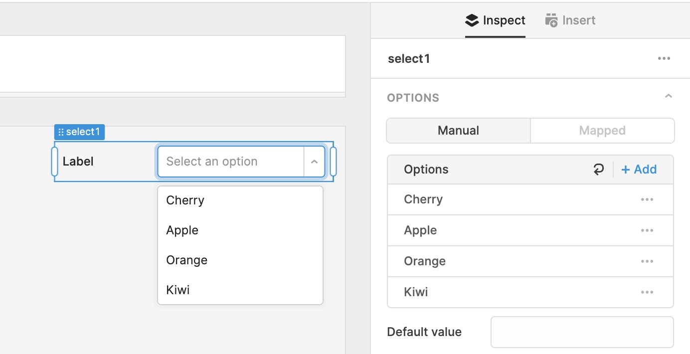
These types of components now have a new Options section, with two modes: Manual and Mapped. If you have a short list of options (e.g. Cherry, Apple, Orange, Kiwi), quickly configure your component in Manual mode by adding them to the reorderable list:
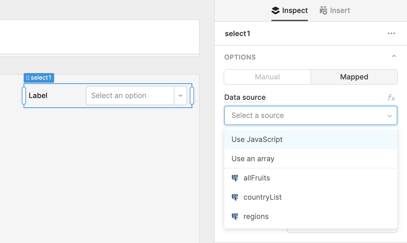
Sometimes you’ll need to generate a list of options from a dynamic data source like a query or transformer, or from a large array or JS expression. Switch into Mapped mode to quickly set up these dynamic options lists:
New settings
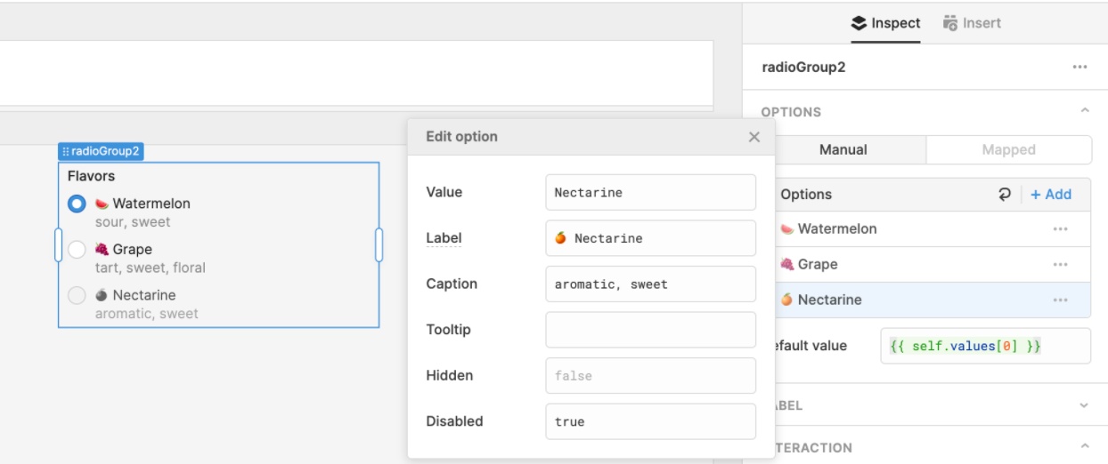
In both Manual and Mapped mode, you can configure settings (caption, tooltip, hidden, disabled) for each item in your list of options.
In Manual mode, just click on an option and enter values for each setting (e.g. “caption ABC”, {{ checkbox1.value }}):
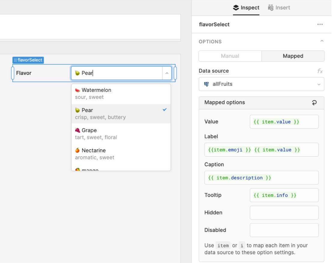
Mapped mode works similar to the .map method on an array. You have access to a special keyword, item, which will allow you to map each item in your data source to these settings you’ve configured:
The new options list editor is much more powerful–dig into our docs to learn more. We’re also working on supporting more settings, like images and colors for options in a Select dropdown. Let us know in our community forum if you have any feedback or ideas for other settings!
Theme editor
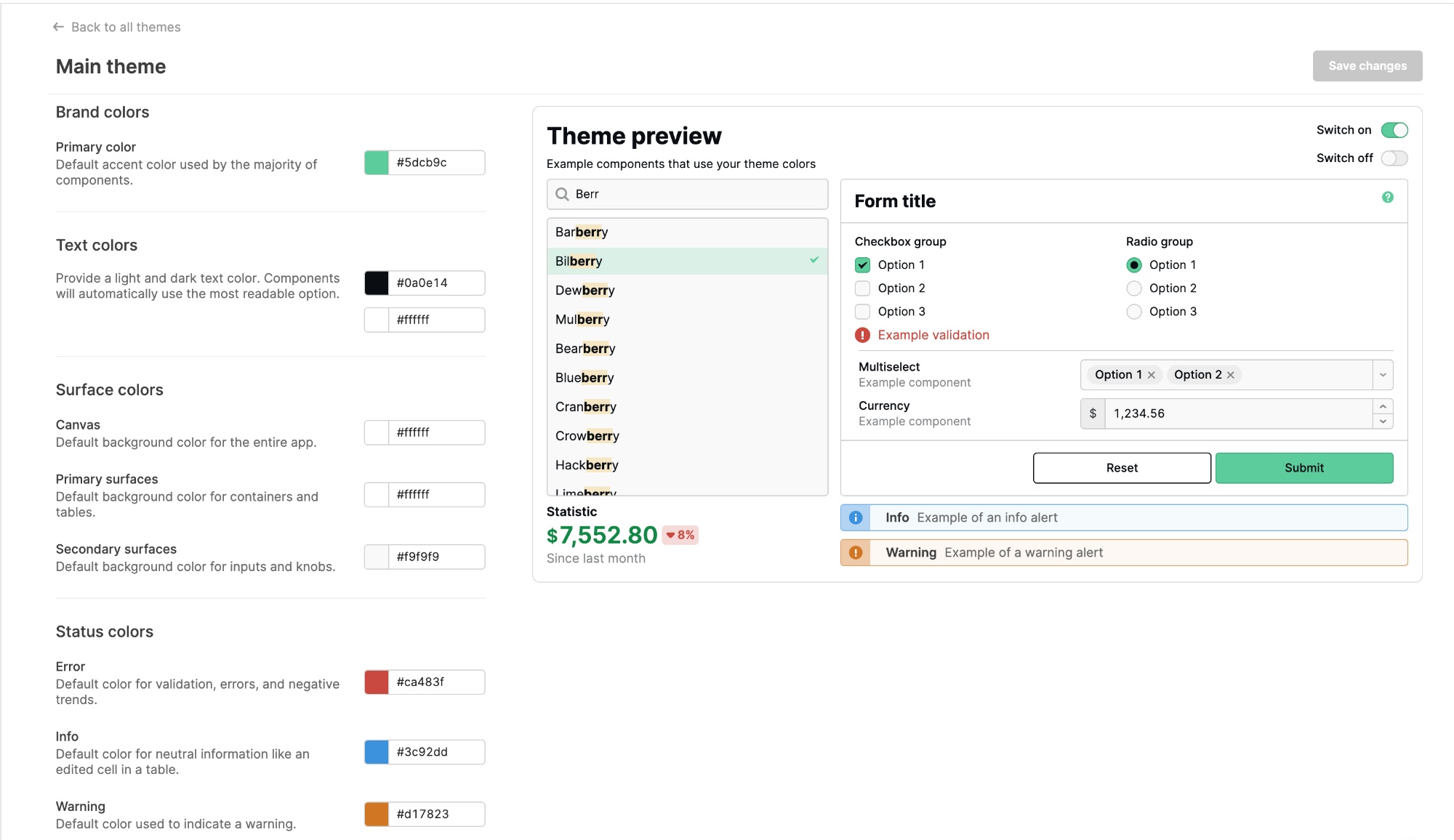
We rebuilt our theme editor, which allows you to create themes that control the look and feel of applications across your organization. Under your organization settings, you’ll find Themes, where you can create new themes and modify existing ones.
The new editor includes improved descriptions of all the style properties and a revamped, live-updating preview–so you can see how your color selections will impact your apps 🎨. We also introduced several new settings, like status colors. You can also now configure text colors: components will automatically use the most readable option of the light and dark colors you choose!
Themes are available on Business or Enterprise plans. We’ll soon be adding even more properties–so be sure to drop us any feedback in the community forum.
Fixes and improvements
- Simplified the “query success” setting in the query editor
- Improved autocomplete for Form and Text components
Check out this guide to see the on-prem versions and their release notes. These fixes and improvements will be rolling out to on-prem customers in the next few weeks.