9 new components–File Inputs, Buttons, Tags, Listbox and more!
We’re rolling out 9 redesigned and rebuilt components, including fully overhauled, existing components (Button, File Button, Link) and brand new components (Tags, File Input, File Dropzone, Listbox, Multiselect Listbox).
Just like the input components we released a few weeks ago, these offer brand new configuration options, built-in and custom validation rules, and expanded style editor support. These components were also built with accessibility in mind.
Listbox and Multiselect Listbox
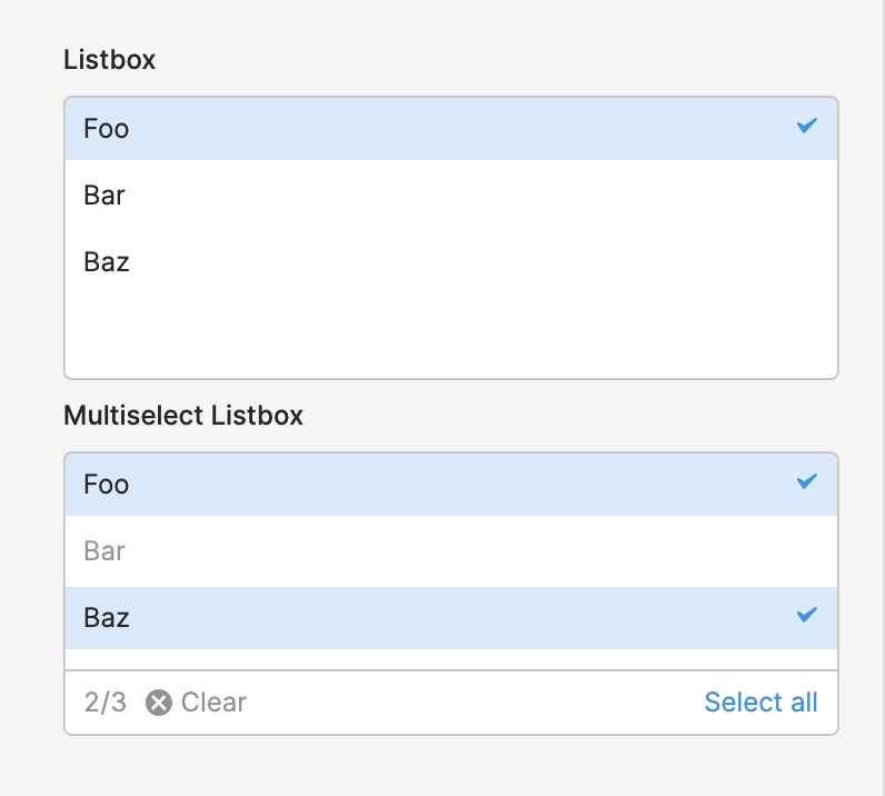
Listbox and Multiselect Listbox allow you to display a list of selectable item(s) to your end users. You can dynamically set the default selected item(s) and/or disabled item(s). There’s also built-in support for fuzzy search on the values or labels, all you have to do is set the search term (e.g. {{ textinput1.value }}).
There are plenty more settings you can configure, even down to the empty state when no options match your search term. Additional functionality includes: an optional Tooltip with support for GitHub flavored markdown, custom validation (e.g. min/max items, custom error messages), event handler support, and more!
Button, Outline Button, and Link
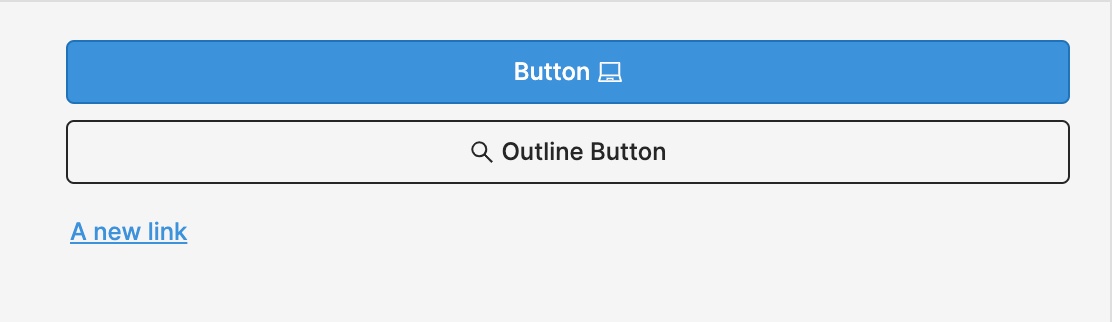
The refreshed Button component and new Outline Button component have lots of new functionality. For example, you can dynamically set the loading state (e.g. {{ query1.isFetching }} ) to show a loading animation and disable interactivity for your users while your query is running.
You can switch between a regular, Solid Button and an Outline Button directly in the “Style” section of the Inspector for either component–you’ll also find more advanced style editor support.
Lastly, we have a new Link component that supports additional configuration like prefix/suffix icons and an optional Tooltip. You can use the Link component with any event handler, like opening a webpage or another Retool application.
File Button, File Input, and File Dropzone
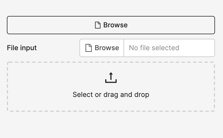
We now have 2 new ways for your end users to browse and upload files–File Dropzone and File Input–and we’ve rebuilt and redesigned File Button. All of these now support single or multiple file uploads, and have 3 consistent properties to interact with and reference elsewhere in your app: (1) value: an array of base64 encoded strings for the selected file(s) (2) files: an array of file metadata, like when it was last modified, the file name, type, and size (3) parsedValue: an array of JS objects or arrays that Retool automatically parses from uploaded files (Excel, JSON, CSV, TSV and text files are supported).
They also support custom validation (e.g. min/max file size, custom error messages), prefix/suffix text and icons, an optional Tooltip, and so much more functionality.
Tags
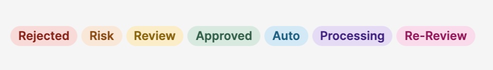
Lastly, we’ve also added a new Tags component, a presentational component typically used in apps for things like categorization. It now has dynamic and automatic height: growing as you add additional tags as well as support for an optional Tooltip.
These components won’t be the last–we’re continuing to expand our component library and add more functionality and customizability to those you’re using today. Drop us a note with any feedback (or requests for new components!) at support@retool.com.
Fixes and improvements
- Added a button to the Users page for admins to download their user list as a CSV
- Fixed previewing apps with multiple versions so that we now support previewing any published release, as well as the current working version
- Added appName to retoolContext so you can dynamically access the name of the current app (e.g.
{{retoolContext.appName}}) - Added the ability to copy table names from the database schema browser in the editor
- Added a submit event to the Notes component
- Added the ability to set custom content-type on Google Cloud Storage upload query
- Simplified the History modal further by removing an unneeded entry type
- Fixed cases where drag-and-drop could get blocked by iframes on the canvas
- Fixed unexpected layout shifts on some apps with multiple Text components
- Improved performance of apps with many dynamic height components
- Improved the query selection dropdown for event handlers to include the name of the resource for a given query
- Improved performance on initial render of the canvas and Container components
- Added a new option to Tabbed Container to preserve UI state across hidden tabs
- Improved the dialog when deleting multiple components to show child components that will also be deleted
- Added an option to customize the 'no rows found' text when a Table component is empty
- Fixed overflow issues with long before/after text in Text, Number, and Password inputs
Check out this guide to see the on-prem versions and their release notes. These features will be rolling out to on-prem customers in the next few weeks.